Zombie

Leave a Comment
the point of this was to get to know the rig better and to work in IK and FK. so far I've only worked with the standard setting, i think it's FK. its the one where you control from the solder down. 
The first pose is supposed to be sadness. one thing i found really hard with this rig is that you don't have that much facial expressions so you have to rely a lot on the body.

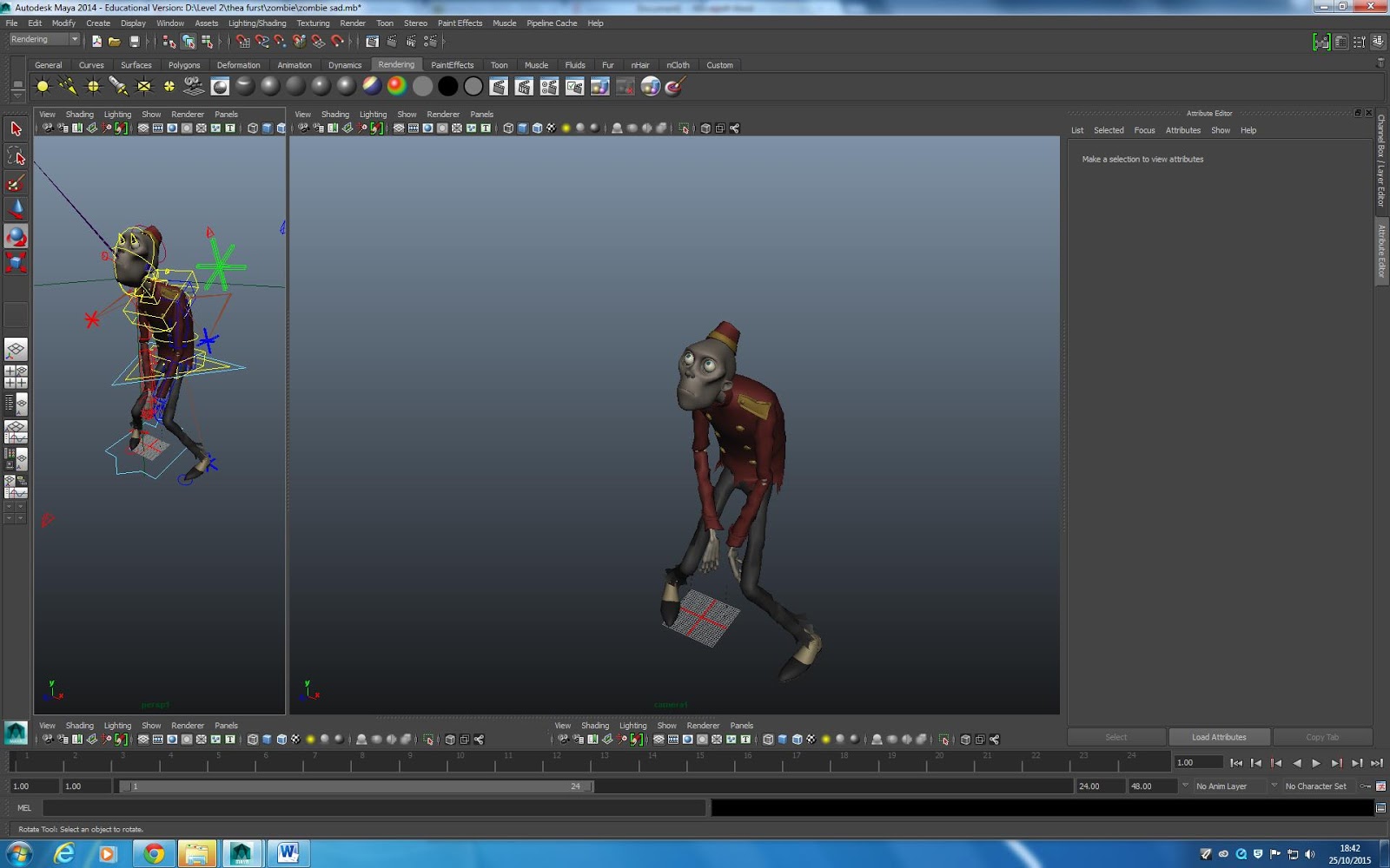
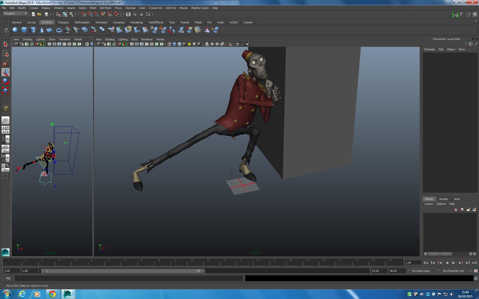
the next expression was disbelief. i wanted to do something slightly different then the first pose i thought of. I did the pose then started with the details. when i was happy with the hand I saw that the pose wasn't really in balance. 
 I tried out an other pose that i find a bit to close to the last one and he looks more scared than in disbelief.
On the last try I went back to the first idea. The pose is based on Real Housewife's (any one of them really) and whenever there's a drama this is the expression of disbelief they give with a follow up of  "Oh no she did not!". It looks surprised as well  but I think it works.


SHARE:
0 comments

bouncing ball 3D

Leave a Comment

I made the bouncing ball like we have learned in 2D with the time charts. I'm not sure I did everything in the right order tho. I started with placing the ball 1, 13, 25 before I made the other key frames. Once that was done I went in Graph Editor to fix the easing in and out maya does for you and this is what the graph looked like. I'm not sure if that's what its supposed to look like but figured it was ok, at least the bounce looks ok. I made the tweaking on the graph and then I tried to find out how to export, but I don't know how to do that and during this search for how to do this I remembered that I forgot to set the project so I'm not even sure where the files are. you learn from your mistakes so hopefully it will open, but I have to make it again and go thoroughly trough the steps and not do it on auto bad habits.  


SHARE:
0 comments

Modelling in Maya sugar pot

Leave a Comment

 The sugar pot was easy to make the shape of. I made a sylinder out of the basic shapes you have in maya then Jeng showed me how to make a smaller one and put it inside so you get the hollow inside with edges.
Then I used the edge loop tool on all the edges, first 4 to make the thicker parts on the bottom and top then 2 for each so the edge would be more defined.

Next I made the lid with the Curve tool.

I defined some of the details on the top in the same way as before.


Next was the handle and the hinge but it was a bit too complicated for me at this point so I took some artistic liberty and did not make anything and just left it as a normal lid.

SHARE:
0 comments

Modelling in Maya teapot

Leave a Comment
Modelling in Maya is going ok. Because I wasn't there the day you thought us Maya I've been lacking behind but I hope I get that sorted out soon. I sent a mail to Simon asking for a quick 101 so hopefully he'll have time and I'll be at the same level as the rest of the second years next week. this week I got a lot of help from Jeng and Wilde so at least I have something to show for tomorrow.


This is the teapot I've made. As you probably can see there's a few mistakes I don't know how to fix at the bottom and around the edge of the tip, but hopefully it works well enough for what were gonna do on the Monday lesson.

I made the shape with the curve tool and used the edge loop tool to make the edges on the top a bit more defined.


The handle is made the way you showed us with the extrude and then a hole at the bottom where I connected the edges. 


SHARE:
0 comments

animation exercise

Leave a Comment
animation exercise using time charts.


SHARE:
0 comments

how the Diorama works

Leave a Comment

 I looked up paper dioramas just to see how it works in real life and also to see how it looks with barely any colour.


  These pictures I added to this post for style inspiration. I'm reconsidering the style of the diorama and I'm cutting back on the story because it was way to long. (It would be about 2 min and I just found out/got told again that its going to be 30 sec.)
This is a crap drawing to test out how it will work in layers. what I've done and what I'm probably gonna do in the finished animation is to have the mountains in the same colour and then add a layer between every mountain in a see trough lighter shade.

After the lectures we had on light I got really inspired to try out light in this diorama. What my "vision" of this diorama is now is that it's going to be from a strong light sourse in the far background (Late day sun or early morning) peeking up from behind the Mountains.

Like in this picture. The last layer is going to be inspired by this and some pictures I have from the mountain that was behind my room when I lived in Hardanger.

The first cople of mountains are gonna be based on these in Ulvik.


SHARE:
0 comments

Room Light and Shades

Leave a Comment


The Blue room is my first try on this task. I tried to Focus on the direction of the light working first from the shadows then on the highlights and light.
SHARE:
0 comments

Colours

Leave a Comment
Colours have a strong impact on how we perceive things like posters, webpages and the general feel in movies.
by colour use you can tell an important message. For example, facebook wants to be perceive as serious, professional and technical, all qualities found in blue, while McDonalds on the other hand wants to be perceived as fun and playful so they use yellow. And lately they’ve wanted to look healthier so they've started to have green and brown things which is perceived as natural and ecological. Green can also be seen as sick, which they’ve used in movies like fight club and trainspotting to set that mood.


http://globalpropaganda.com/articles/TranslatingColours.pdf
http://www.mariaclaudiacortes.com/colors/colors.html
https://en.wikipedia.org/wiki/Color_in_Chinese_culture
http://www.kunstoghaandverk.org/galleri/fargsymb.htm

SHARE:
0 comments

Diorama

Leave a Comment
my plan for the diorama.

i want it to be in Nordic looking woods (cause that's what i know). Proper thick forest with a simple style, like the one they have in year walk. Hopefully i can time it to Emilie Nicolas' Melancholia
colours- blueish green and dark blue

song: 
https://www.youtube.com/watch?v=1UlBqMP8CHI


SHARE:
0 comments

movies with good cinematography

Leave a Comment

https://www.youtube.com/watch?v=u2xTcs3XuYc
1.38

It explains the characters so well in this shot. how he's become the kid and she is the grown up.

https://www.youtube.com/watch?v=R_7weUR0oMY

i tried to find the  clip of him in the apartment where he's being accused but i could not find it so this is the closest i got. in the beginning of the trailer you see a short clip of it.


SHARE:
0 comments
Next PostNewer Posts Home

Labels

PREMIUM BLOGGER TEMPLATES BY pipdig